Want to make more sales, bolster your brand, and maintain a strong presence? Then your screen printing business needs a professional website.
The web, e-commerce, and online stores are how business gets done. It’s an expectation from customers. Think about it: more than 100 million Americans are Amazon Prime members.
And customers don’t just expect a website. They demand it. Without a website, it’s like your business isn’t even real.
But a website is expensive, time-consuming, and something that you couldn’t possibly whip up in an afternoon…right?
Wrong.
You can make a professional website in an hour or less. All you’ll need are:
- Your logo
- The logos of some customers you’ve worked with
- A couple of high-quality pictures from your shop
- A SquareSpace account
- This guide
How successful print shops use their website
Before we dive in and show you how to build a website, you need some inspiration: take a look at the best screen print shop websites.
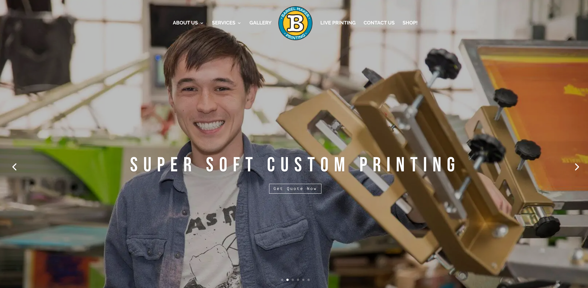
How do successful print shops use their website? Our favorite example is Chicago’s Barrel Maker Printing.
You don’t need to copy everything they do on their website.
Instead, learn why they’re doing what they do.
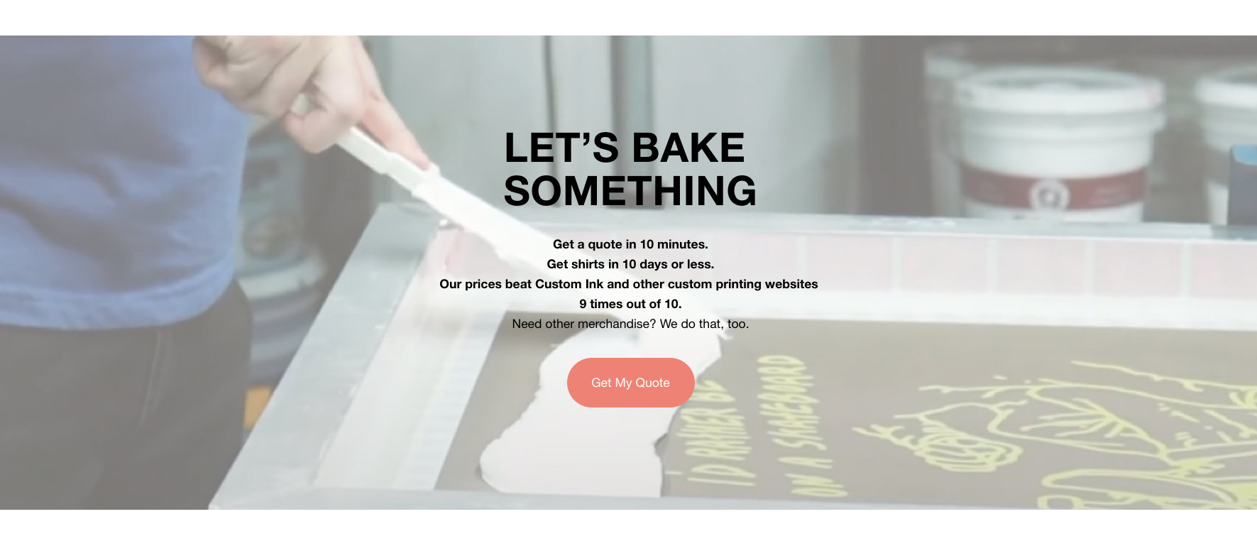
The call-to-action
Get Quote Now.
That’s what Barrel Maker’s prominent (yet tasteful) call-to-action tells customers.
A call-to-action is the single key ingredient to a successful website.
The entire point of the website, after all, is to get a visitor to do something.
So what does Barrel Maker want customers to do? They want them to get a quote, yes, but ultimately they want you to contact them and share your contact information so they can immediately contact you!
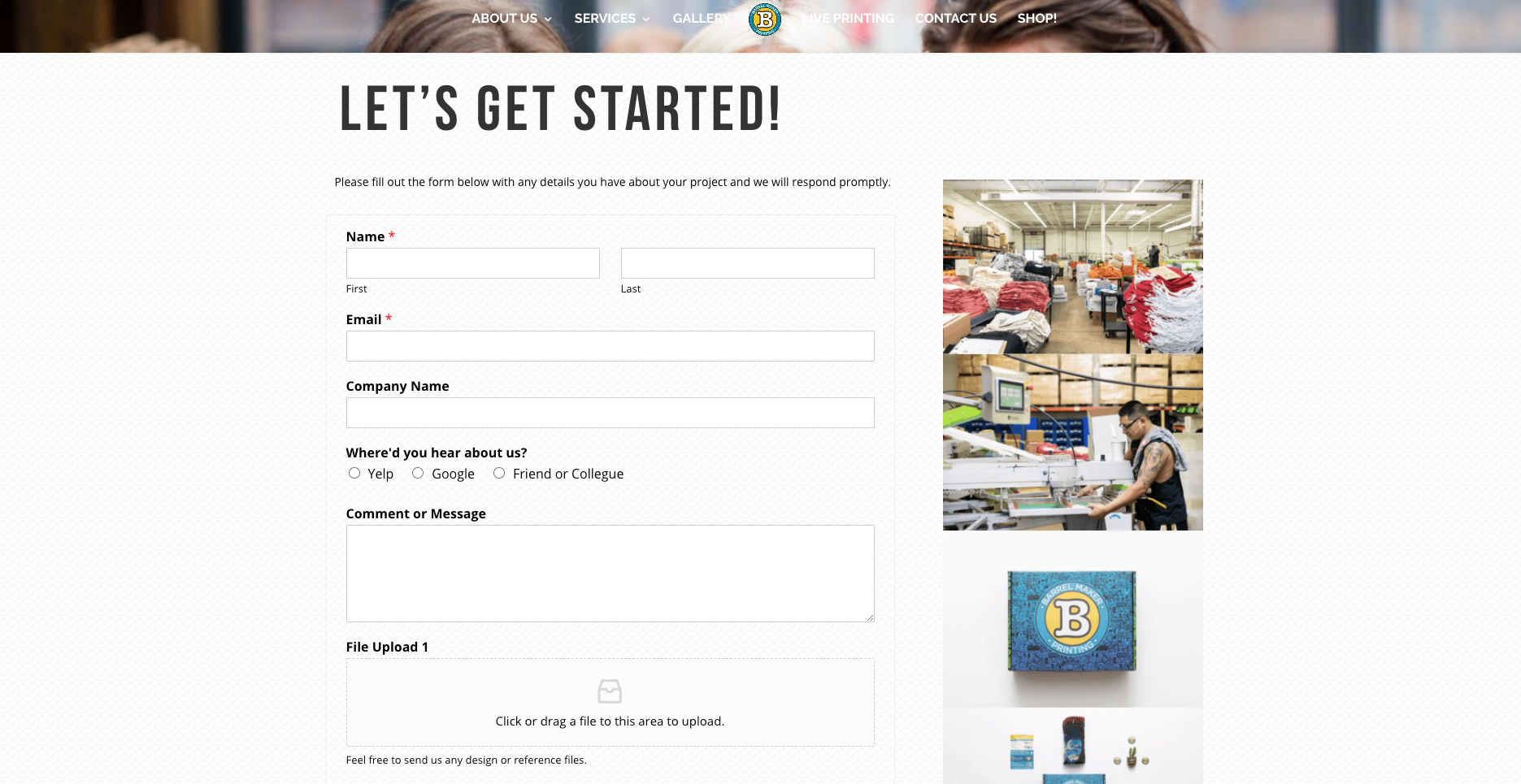
Here’s where the Get Quote Now link takes you.
Social proof
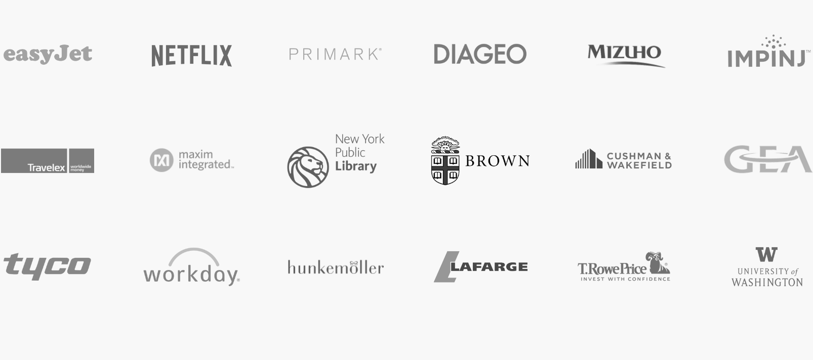
Have you ever visited a website for a product and seen lots of logos for other companies on their website?
This is called social proof.
It’s a powerful (but subtle) cue to the customer: here are all the awesome customers we’ve worked with that love us and think we’re amazing.
You have to use social proof on your website. If you claim you’re the biggest and best and most favorite print shop in the tristate area but don’t back it up with any proof, it just sounds like you’re tooting your own horn.
This is the exact reason so many companies use testimonials as marketing materials. Social proof nudges the customer into thinking, “Hey, that shop is somebody that I really want to work with – especially since all these other great customers have too.”
Why you don’t need an online design tool
A lot of print shops think they need an online design tool to succeed.
That isn’t true, and here’s why: online design tools don’t produce good orders.
The most profitable, reliable, and least difficult orders come from customers that understand they need aren’t professionals and need help. Think about it: school districts, retail businesses, and other large companies don’t order merchandise by designing it through a design tool!
They leave it to the pros.
But when someone’s cousin who’s an amateur designer gets cracking on that design tool and creates a 12-color print that they need immediately…
That’s just not the type of order your business needs or wants. Small, complex print jobs that require a lot of back-and-forth with the customer put a lot of entrepreneurs out of business.
How to plan your website
So you know you need a website…but how do you actually plan it?
The process is simple:
- Start with pen and paper
- Make sure you have everything you need (outlined below)
- …then put it online!
The truth is that you don’t need to know how to “code” to make a website anymore. In fact, it’s much easier to avoid coding entirely!
If you can use Facebook or Google, you’re advanced enough to build a website. It simply isn’t that difficult.
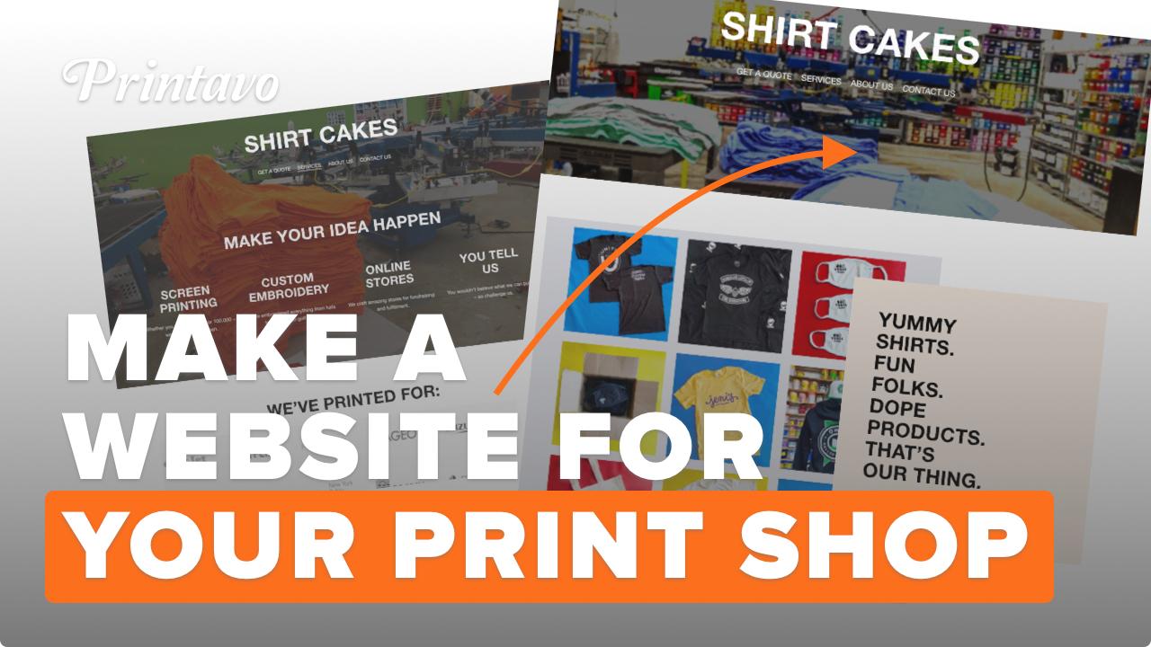
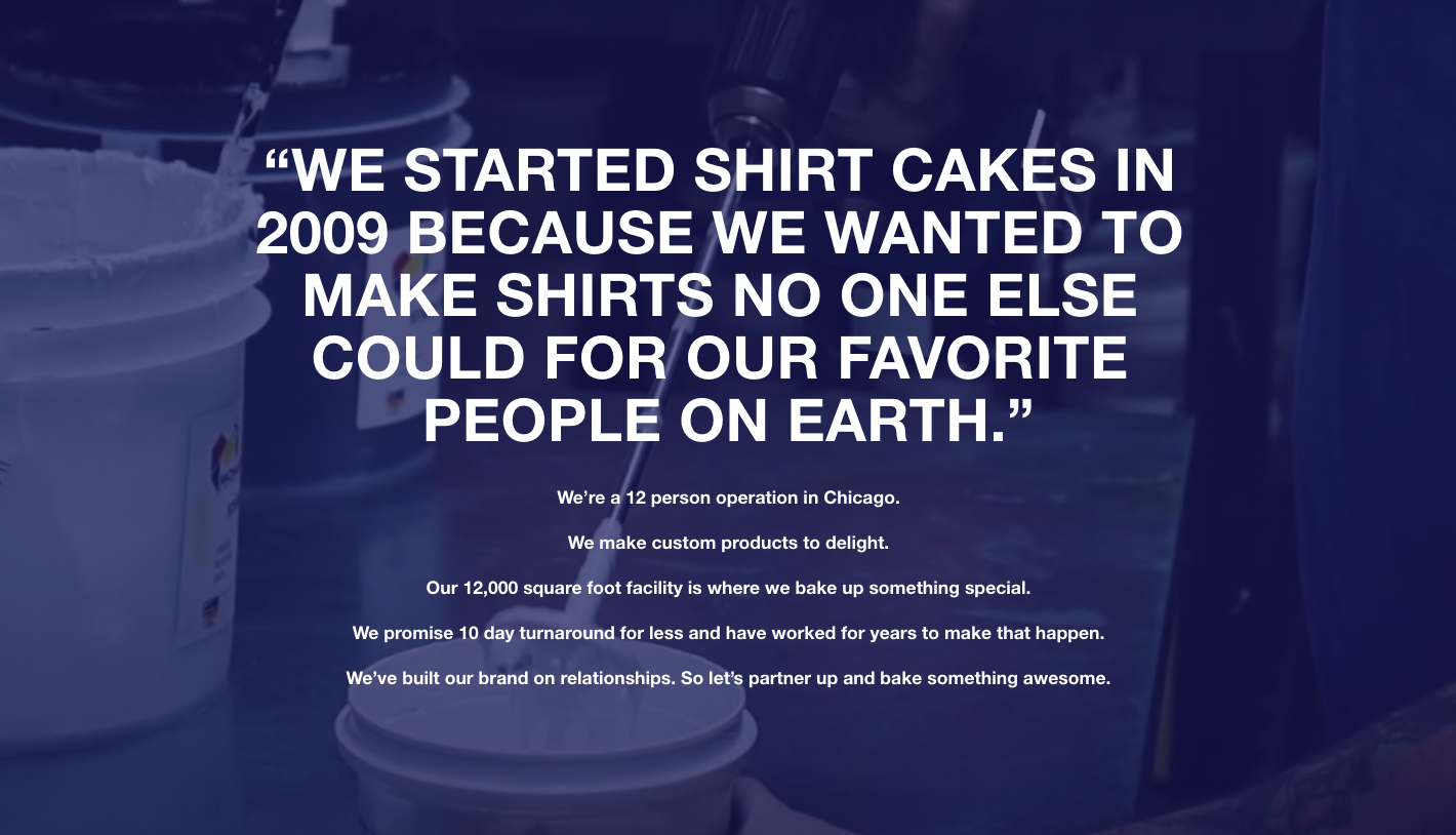
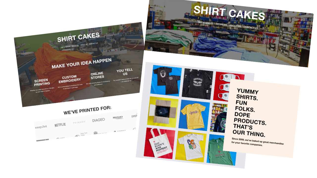
We’ll show you how we made a website for our (fake) company, Shirt Cakes!
Know what your site needs to succeed
Begin by gathering and listing out everything you’ll need to build your site.
Think of this as the preparation phase: we’re collecting all of the different pieces that we’ll plug into our website as we go.
Logos, branding, and colors
Hopefully you already have a good logo you can use. If you don’t, now is the time to crank one out! We grabbed a simple cupcake icon and threw it on top of our fantasy brand, Shirt Cakes.
Next, think about your branding. What do you want customers to think of when they think about your business?
We wanted people to think of sweets, cakes, and desserts. “Yummy Tees” is our tagline.
If you’ve got a niche that you’ve focused on, this is a great way to highlight it.
Colors are a powerful way to signal to customers, too. Don’t get too hung up on color, just pick one or two colors and stick with them.
We chose orange and yellow – classic “food” colors.
Contact info
You really need to think about how you want customers to contact you.
You can use something like Jotform or Printavo’s Inquiry Form to capture customer info – but then you have to follow up with them quickly.
Do you want customers to call, email, or text you?
Pick one way to communicate and master it, but be sure you cover all your bases.
“About Us” / “Our Story”
Ever wondered who you’re doing business with – or better yet, ever picked a business because you knew they had a cool story or some great people that worked there?
This is your chance to tell the story of how your business started. Why do you do what you do? What is interesting about your business?
You don’t need to spend a lot of time here. Some shops just share their shop dog!
But you should absolutely aim to humanize your business, tell your story, and seem authentic. This is a fast, easy, and long-lasting way to do it.
It goes a long way, and wins customers in the long-run – even if seems like a small gesture.
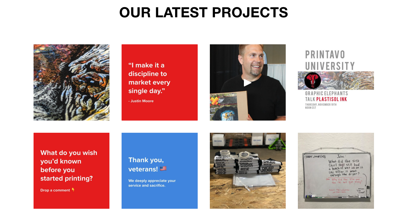
Social media
Do you regularly post to social media?
Do you have an Instagram, Facebook, TikTok account?
Maintaining a web presence requires regular posts to social media.
Print shops don’t need to reinvent the wheel to have great pictures of their merchandise. Just make it a habit: every job should have one glamour shot.
Your site should feature the best of your social media. If you know something grabs attention, use it!
Otherwise, all you’ll need are links to the social sites you want to share.
Call-to-action
Remember: your call-to-action is the key to a successful site.
If you know what you want customers to do, you can ask them to do it.
The most common (and effective) is simply Get a Quote.
But you don’t have to limit yourself to that. Some other examples of super effective calls-to-action include:
- Talk to a real person
- Order now
- Save now
- Try us
- Let’s do this
Your call-to-action can be as professional or casual as you like.
But make sure it’s prominent and that you’ve thought it out beforehand.
Use pen and paper to draw your site
The most effective way to plan a website is old school: get out the pen and paper.
We suggest a simple system: fold a blank sheet of paper in half and write “DRAW SITE HERE.”
Under that heading, start drawing your site. It should basically be an outline.
On the other half of the sheet of paper, write “WHAT IT IS.”
On this side, write notes and details about each element of your site.
The better you plan, the easier it is to build
Why go to all this trouble to draw out a site on pen and paper if you’re just going to put it into a computer?
Because it’s very easy to waste a lot of time and energy getting hung up on the endless possibilities when you actually try a website builder.
It’s much easier to have a game plan and execute it – versus trying to discover each and every little font, image, and feature.
Remember: focus on what you want customers to do and stick with it.
Try SquareSpace to start
SquareSpace (and even something like Wix) is a great way to start building your website.
We used one of SquareSpace’s pre-built templates to help us. It only took us a couple of hours to put everything in place.
The best way to save time is to use templates and modify them to your liking.
Another tip: it’s much easier to build your site if you’ve already selected images, copywriting, and other look-and-feel elements of your site before you try to build the site.
You can configure colors and fonts and go really deep into the design of the page to match your brand – if you want to.



0 Comments