If you need some inspiration for your screen printing shop’s website, look no further.
Branding is everything for screen printers. And great brands know that their website is where it all begins. These screen printing websites have nailed it – they’re either pitch-perfect, vividly beautiful, or extremely useful and purpose-driven – but all of them serve as strong branded statements.
Any shop can print you a shirt. So your online presence is how you can truly set yourself apart.
We’ve seen a lot of amazing shops struggle with their websites. We’ve also seen small startup shops grow and thrive because of incredible websites.
Sending the right signals from your brand takes time and iteration, but the payoff is huge. In a competitive market like custom apparel printing, your website is proof of your expertise.
Here’s 7 of the best screen printing website designs out there.
Industry Print Shop
Who
Industry Print Shop.
Location
Austin, Texas and on the web at https://www.industryprintshop.com.
What you can learn from it
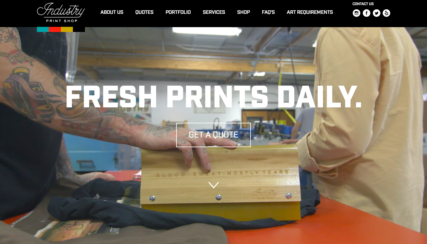
Simple, high quality video of your shop and printing process is more than enough to generate excitement.
There’s a simple call to action. The prominent “Get a Quote” button is front and center.
The user knows exactly what to do, and the company sends a clear message about where they want you to click.
They have a clear branded statement. Industry cleanly defines the scope of their work and what their brand focuses on: “From concert posters and fine art prints to custom t-shirts and apparel, Industry stays true to the hand pressed aesthetic of screen printing.”
Why it’s great
Industry Print Shop shows that less is more. The website is simple but effective.
They show examples of work they’ve completed for clients. A simple portfolio is linked – right from the homepage. Users want a quick way to see proof and examples. Not only are the prints beautiful, they’re perfectly photographed!
What sets it apart
Great integrated video combined with a simple user experience makes Industry’s site a bit different.
This website drives the customer directly toward contacting the shop. It introduces what they do in clear terms. It showcases some of their best work.
All-in-all, you’re left with a sense of certainty and forward motion.
Campus Ink
Who
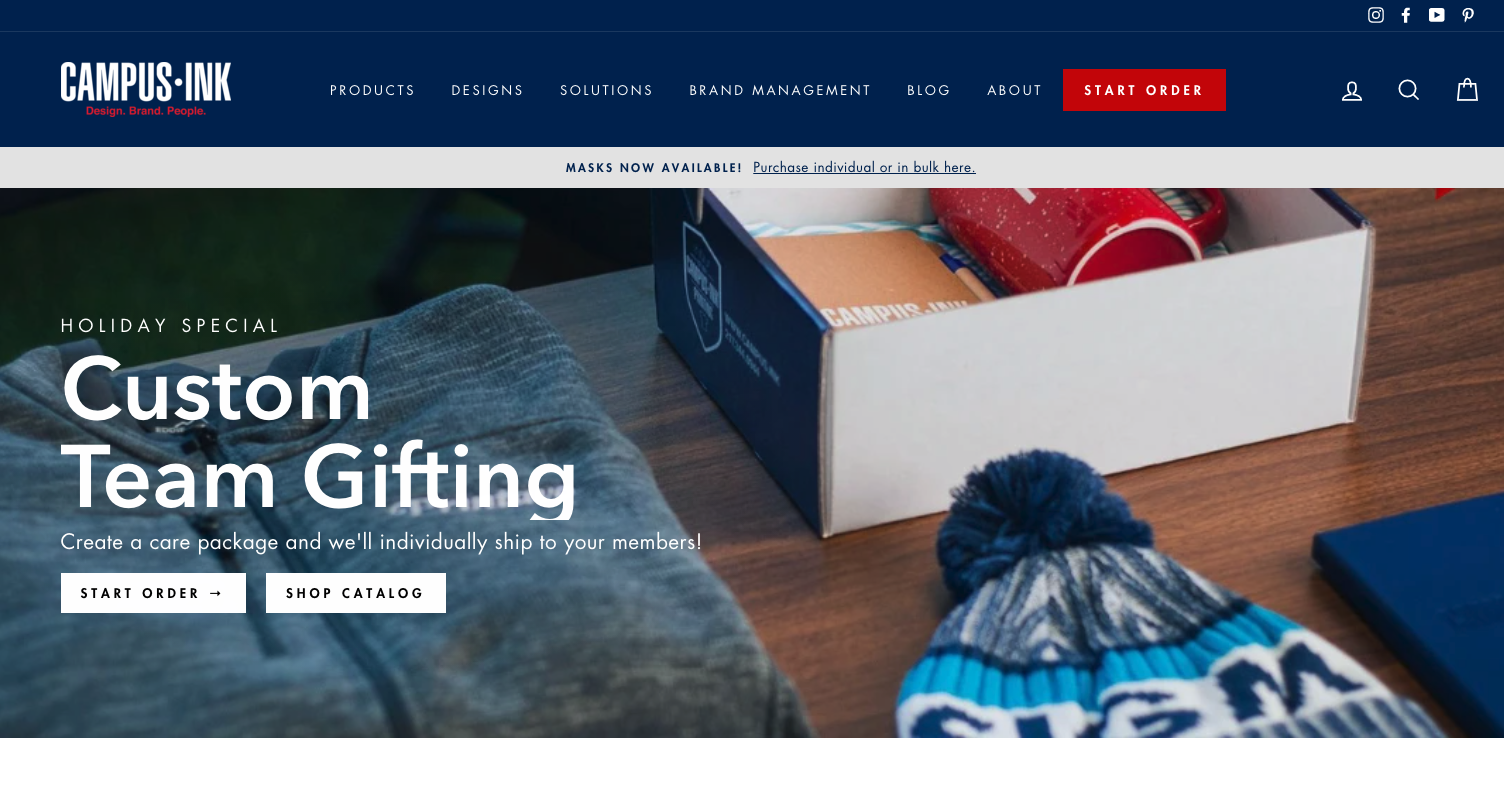
Campus Ink, a print shop that caters specifically to students at universities.
A multi-generational business that has served its community for decades, Campus Ink re-branded about three years ago and has been on a tear ever since.
Their business model hinges on a robust staff of student designers and salespeople that connect directly to college campuses across the US. It’s a fascinating team!
Location
Champaign, Illinois and on the web at https://www.campus.ink.
What you can learn from it
Calls to action are sprinkled throughout Campus Ink’s website, highlighting exactly where customers can go to get immediate satisfaction.
No need to figure anything out on Campus Ink’s site. You can place an order right from their homepage for certain staple designs.
They even had seasonal “ugly sweaters” for the holidays!
Why it’s great
From the sharp images to the focus on content that highlights the Campus Ink team, this site captures the Campus Ink brand perfectly.
Co-owner Steven Farag is constantly tinkering with the elements of the site, adding or subtracting new pieces and experimenting with new copy and images.
Expect it to look a little different when you visit!
What sets it apart
Campus Ink has focused hard on its niche: university students, their organizations, and their teams.
This has propelled the business to new heights. The site has been central to that process, enabling them to reach a broader audience than the University of Illinois.
With a Design Catalog so customers can quickly brainstorm ideas and get inspiration (and a veritable army of designers that are actual college students), Campus Ink crafted a site that captures and keeps their customers.
Envision Tees (1-800-T-SHIRTS)
Who
Led by the inexhaustible Tom Rauen (a long-distance runner, world recorder holder, and leading entrepreneur), Envision Tees has invested heavily in their website.
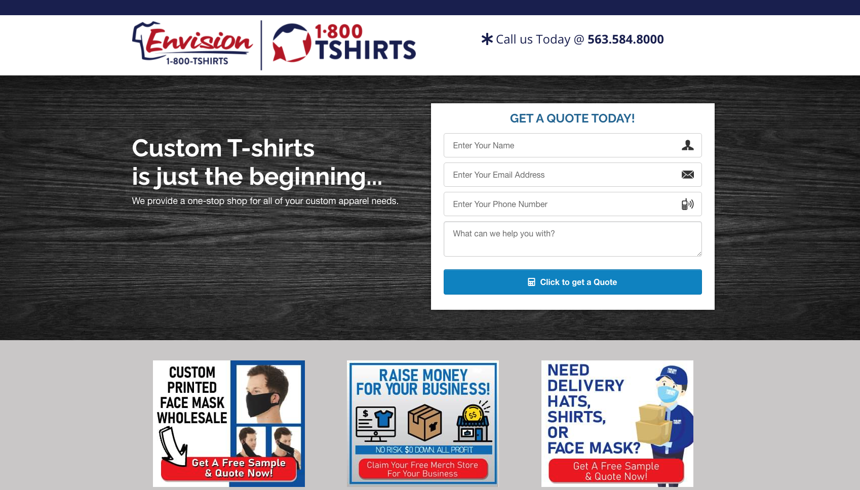
What emerges is something powerful, yet simple – a carefully planned way to funnel customers toward Envision’s sales team.
Location
Envision is based in Dubuque, Iowa and on the web at https://www.envisiontees.com.
What you can learn from it
Clarity is everything.
Every single item on the site is overwhelmingly clear and simple from a customer’s perspective. You don’t need to know anything about custom printing or adapt to a special process that Envision does – they meet customers on their own turf.
There are really only two major “outlets” in the entire website:
- The quote form. Envision wants users to start their quote process – and this lets them collect marketing info early on.
- Envision’s phone number. Envision purchased “1-800-T-SHIRTS” – and it’s prominently featured on the site.
Why it’s great
The product of an arduous process of experimentation, testing, and refining, Envision’s website contains a handful of elements that any shop could copy.
If you imitated exactly what Envision does, your site could absolutely sparkle. These are techniques and strategies that work.
Let’s catalog the elements of the site from top to bottom:
- Get a quote
- This is what they want you to do and they make it easy.
- Masks, fundraisers, delivery services
- Three simple images with sparse text show customers an easy route to get what they need.
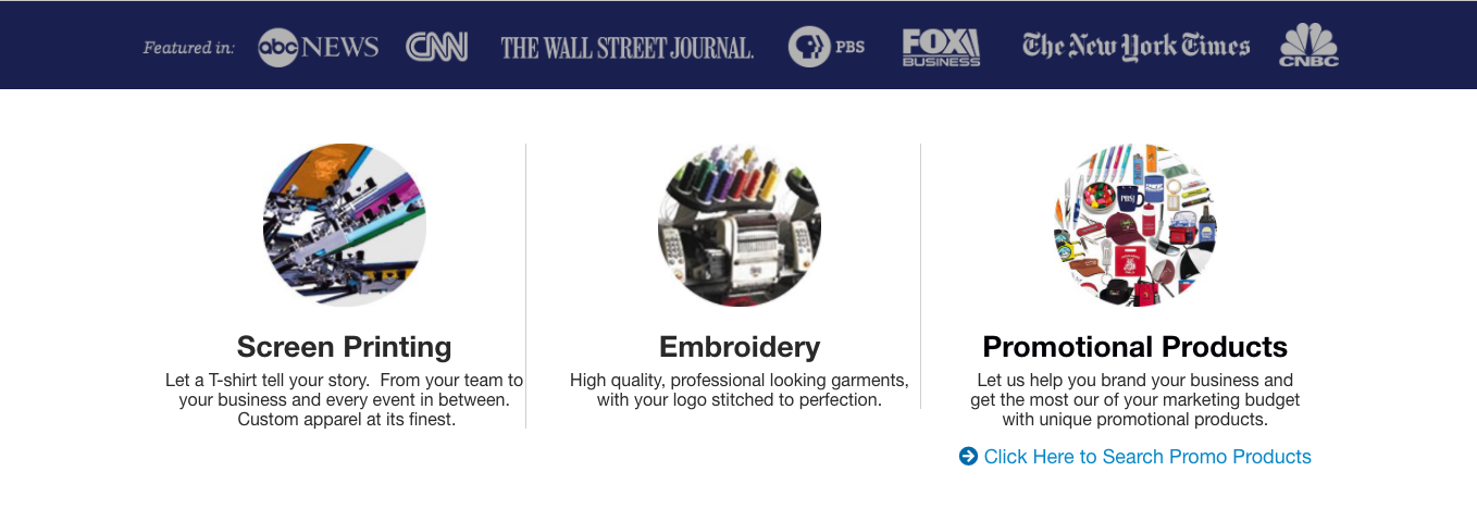
- Social proof via major brands
- Envision uses major brands they’ve worked with to show legitimacy
- What Envision does
- They show screen printing, embroidery, and promotional products
- Team stores
- They offer a route to get your own online store
- Pop-up quote and inquiry form
- They provide a second way to get a quote and inquire
- Call Us
- Another call-to-action to get people on the phone
- More social proof
- They list more esteemed brands and logos to legitimize their site
That’s it – there’s nothing else to their front page. A customer can begin to execute their idea right from the homepage.
What sets it apart
Envision has invested a lot of time and energy into their website, consulting with ecommerce experts and going through an arduous testing process.
If you need an idea for something to add to your site, you could do much worse than simply copying the moves that the Envision team makes.
Printed Threads
Who
Brett Bowden has been an active face in the screen printing industry for years now – helping The Ink Kitchen, Ryonet, and Bella + Canvas produce high-quality educational content – while raising a family.
Printed Threads produces some of the finest marketing material in the screen printing game.
Their Pantone matching videos on Instagram are amazing, and their #macromonday posts highlight details in prints that seem impossible.
Location
Big beautiful Texas and on the web at https:///www.printedthreads.com
What you can learn from it
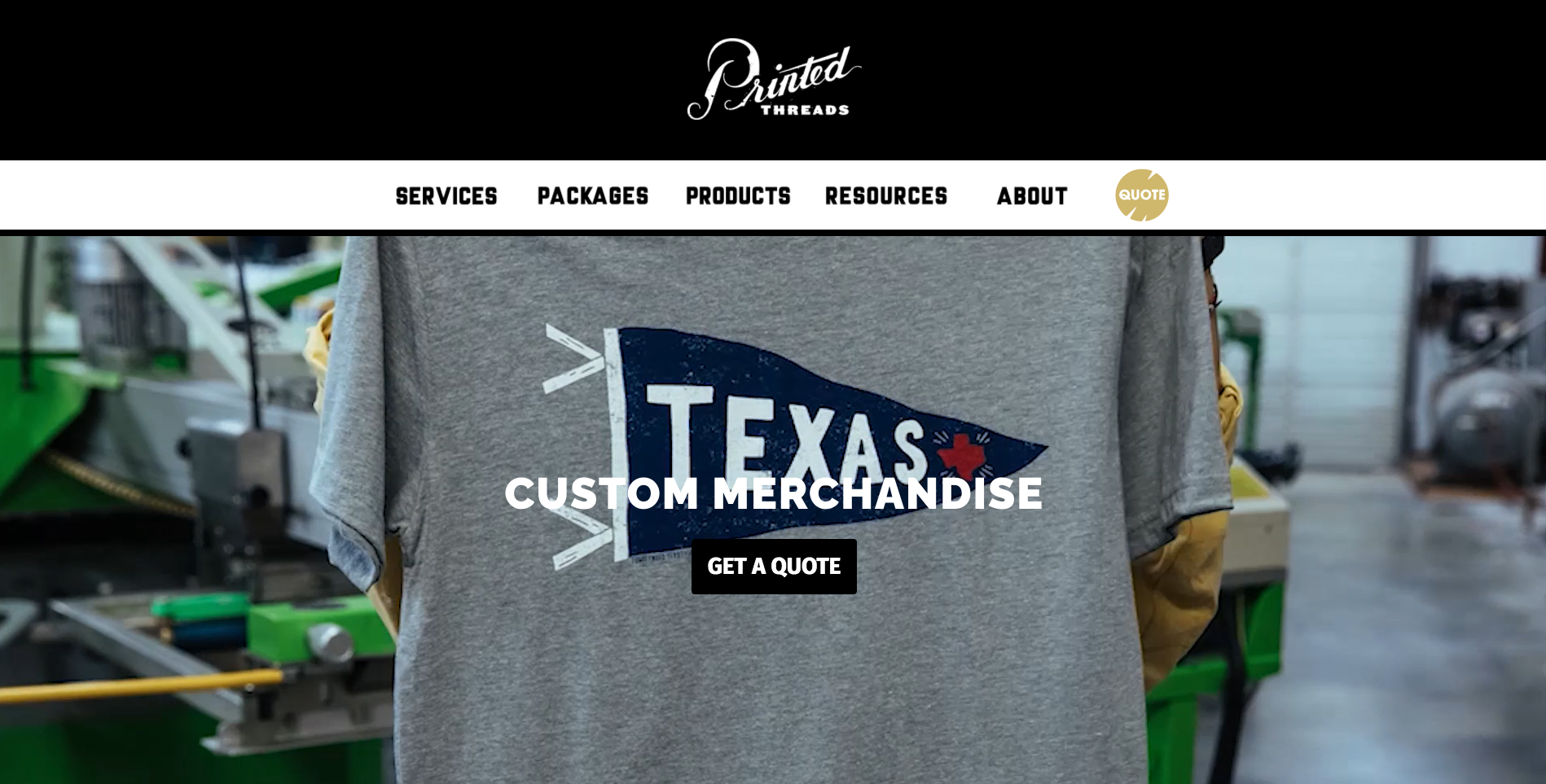
Powerful colors set in a simple schema gives Printed Threads’ site a highly professional feel.
The site reflects the way the shop operates: detail-oriented and with serious intent to deliver something amazing.
With only two major “moves” a customer can make (a quote inquiry or diving deeper into Printed Threads’ products, services, and customers) the site propels users toward a purchase.
Why it’s great
The simplicity and clarity of Printed Threads’ site is obvious. What’s less obvious is that the site has lots of content.
We’re particularly impressed by the Resources section, as well as the way they’ve curated their menu items.
What sets it apart
Much like Printed Thread’s Instagram, the site’s bold and somehow Texan feel is deeply inspired.
Just as their marketing materials are creative, their website is stylish and impactful. It’s not flashy or wrought, but it’s perfectly attuned with their brand and their clients.
Real Thread
Who
Led by Dru Dalton, Real Thread is a team of professionals dedicated to providing extremely high-quality printed merchandise.
Location
Real Thread is based in Orlando, FL – and on the web at https://www.realthread.com
What you can learn from it
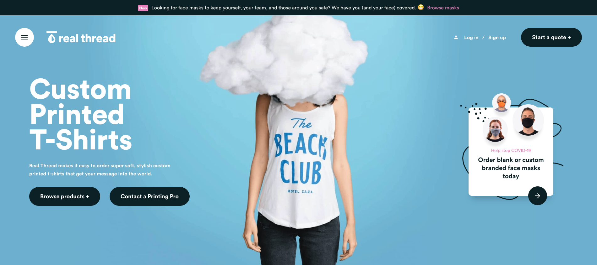
The entire Real Thread homepage is customer focused.
They want to show that they’re good – but they’re really here to make you better.
The site uses some great techniques to draw users in:
- Interactive elements. From simple buttons to the site’s scrolling animations, Real Thread feels “touchable” right away. Users want to interact with this design.
- Answering common questions and addressing concerns. Real Thread has focused on customer satisfaction, and it shows through their focus on their product. They combine social proof – thousands of reviews! – with examples of how they’re focused on the customer above all else.
- Resources that urge action. One of the more unique elements, Real Thread offers downloadable design assets to help you create your perfect shirt. They also address their fulfillment services, guarantee that they’ll deliver on time, and nudge the user toward signing up by offering a 1% credit through their loyalty program. The combined effect is a heightened sense of urgency.
- Simplify a complex fulfillment problem. Real Thread offers end-to-end fulfillment services, so the complex merchandising is left to them.
Why it’s great
This is a top-notch website from tip to toe. It’s as professional as Amazon, Threadless, Custom Ink, or any of the other big e-commerce players.
They blow you out of the water with how high-end their website feels. It’s equal parts advertising and art – more like using an Apple product than a print shop’s website!
They use great copy, simple but professional imagery, and clear examples to tell their clients’ stories. This is a wildly effective technique. You don’t just want to order shirts…you want to emulate someone else that’s become even more successful because of their merch.
What sets it apart
Real Thread invested heavily in their business – instead of in real estate – and their website reflects it. “We’ve got 3 full-time software engineers on staff,” Dru explained when we interviewed him.
Right from the get-go, you’re urged to tell your story. Real Thread makes an emotional connection from the very beginning. Focusing on the softness of their shirts is clever, but it’s obvious they’re more concerned with selling their entire package.
Great service, brand ideation, and soft shirts. – it’s a huge factor in how customers choose garments and it’s something that requires no technical knowledge to understand.
If the shirt is soft, it’s better, right? That’s the crux of Real Thread’s simple and effective pitch.
Barrel Maker Printing
Who
Barrel Maker Printing has grown thanks their quirky, fun-loving, and enjoyable branding.
With a strong investment in artwork and imagery, owner Justin Moore tells us: “If you have $5,000 to spend on your print shop – spend it on good artwork!”
Location
Barrel Maker hails from Chicago, IL with a production facility just outside the city. They’re on the web at https://www.barrelmakerprinting.com.
What you can learn from it
Users don’t just want to trust the people behind Barrel Maker, connect with them.
The homepage’s structure is delightfully simple:
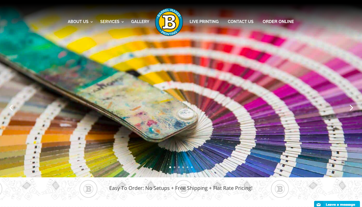
- Colorful hero images and a statement of purpose. There’s barely any copy on this page, but the copy that is there does a lot. It explains what they do, who they are, what their mission is, and shows their past clients – all in one easy-to-digest place.
- Latest Instagram posts. The highly visual theme continues with a simple grid of their latest Instagram posts. Users can quickly connect with Barrel Maker and see what they’re up to.
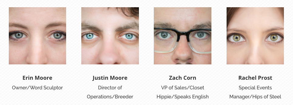
- The employee section. Mentioned above, this is prominently displayed on the front page. It’s no accident – putting a face to the brand creates an instant connection.
- Newsletter sign up and contact form. While Barrel Maker doesn’t utilize a traditional call to action button, they do give users a fast and easy route to connect. You can join their newsletter or get in touch for a quote easily straight from the homepage.
Showcasing your team creates a powerful human connection!
Why it’s great
Showcasing your team creates a powerful human connection!
Barrel Maker’s design balances eye candy with useful info. The team behind the brand is prominently featured
In case you didn’t know, we are huge fans of Barrel Maker Printing and visit their production shop whenever we can. Erin and Justin Moore regularly host live screen printing events (and have a stunning website for that side of their business too) and are anchors for the custom printing community in Chicago.
What sets it apart
But what really sets their homepage apart is how focused they are on showing their employees. This is a delightful way to create a connection with customers: show the people behind the shirts. They invested in high-quality photos that are intimate and unique – close-ups of their employees’ eyes that zoom out to reveal a full portrait when you hover over them.
Trust Print Shop
Who
Trust Printshop, a tight-knit shop with an impeccable eye for design and tastefully executed prints.
Location
Trust is based in Ft. Worth, Texas and on the web at https://www.trustprintshop.com.
What you can learn from it
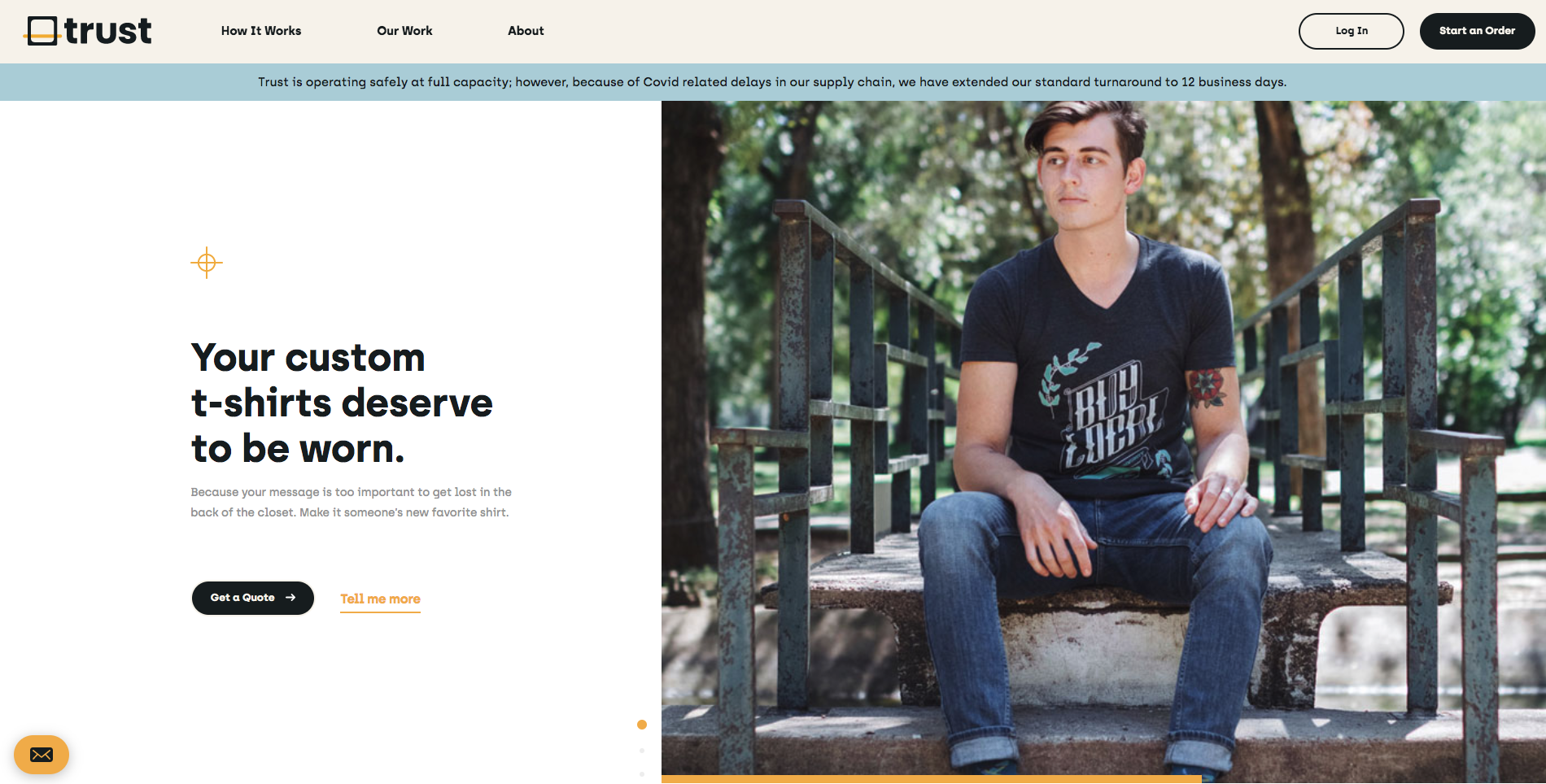
Trust goes a step further with the content on their homepage. It’s equal parts persuasion (“We’ve worked really hard to make the process easier so you can focus on the important things”) combined with proof. Here’s the moves they make:
- Emphasize stress-free ordering for busy people. Trust knows its core audience is marketers and busy entrepreneurs. That’s why they emphasize their process as much as their product.
- Large pull quotes from reviews. They let the customers do the talking. This strategy is a winner because no one wants to read a sales pitch. But something a customer actually said? That’s interesting.
- Offer a sample. This is a great technique to show how serious (and trustworthy!) Trust Printshop is. You can drop in and get “your new favorite shirt,” for free. Now that’s a serious hook!
Less is more, but making something simple doesn’t mean lower quality of interaction.
Why it’s great
The user can only take a few paths through this website, and all roads lead to contacting the shop or starting your order.
This is a powerful website.
What sets it apart
Clean and functional, Trust masterfully demonstrates how a shop can leverage limitations to create a great user experience
Trust Printshop’s website is an immediate stunner. It’s bright, colorful, and simple. You aren’t overwhelmed with options, but are instead funneled toward “Get a Quote” and finding out about the shop’s process. Just check out how they only offer 3 menu options:

They show you their logo, offer more info about their ordering process, show off their recent work, and even lead you to more info about the shop’s history and employees.
But that’s it! Nothing to overwhelm you, nothing superfluous – just the basics.
By limiting what users can do, the design simplifies the paths that users will take through the site. This means curating the best possible experience for every visitor is a simple and streamlined process: point them toward the (really good) quote generator and leave everything else out.
Custom Ink
Who
Custom Ink has emerged as one of the screen printing industry’s dominant direct-to-consumer ecommerce brands.
Their design tool is considered an industry standard. Many shops will tell you stories about getting designs that are just screenshots of Custom Ink’s design tool.
But don’t begrudge Custom Ink – learn from them. They’ve mastered ecommerce and their website contains a plethora of ideas
Location
Custom Ink is headquartered in Fairfax, Virginia. But they contract out the actual printing to dozens of screen print shops across the US. Their site is located at https://www.customink.com.
What you can learn from it
Wait a second, what’s this doing here? Aren’t these supposed to be print shop websites?
Yes, we’re going to give credit where credit is due – Custom Ink has put in the work to design a slick and wildly useful website.
The simple “self-serve” nature of their website is something a small operation simply can’t expect to pull off easily. But there’s still plenty to learn from what Custom Ink does.
They have to get their website right, after all.
It’s the backbone of their business, and it’s certainly possible to make the argument that Custom Ink’s product is their website. But there are several interesting moves they’ve made that are worth considering:
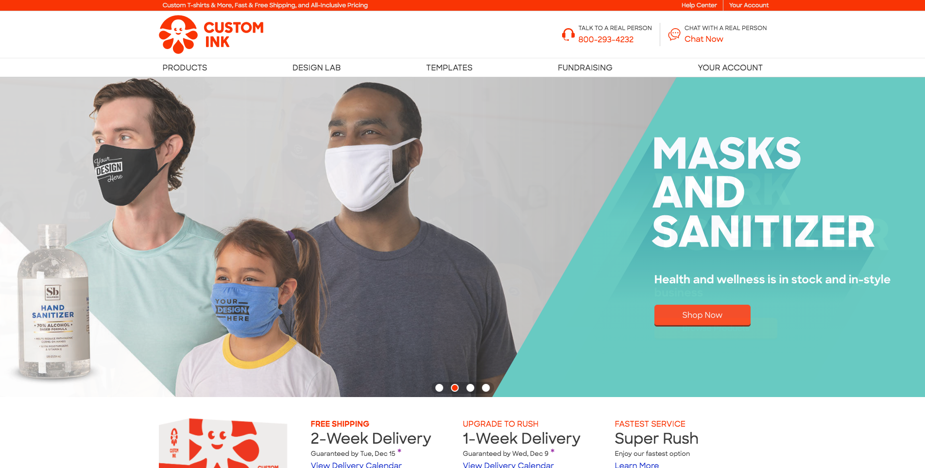
- Their hero image is someone using their product. Not the shirt – but their custom mobile designer. Contrast that to the hero images of the other shops. It’s less “authentic,” but equally informative (“You can use your phone to design your shirt!”)
- Extreme clarity about next steps. The “Start Now” button isn’t just a call to action – it’s basically the only thing a user can interact with. You have no choice but to get started!
- “Talk to a real person / Chat now.” This is a great move. Custom Ink is accomplishing two things here: they’re putting their service and contact info right there, and they’re showing that customers can get help immediately if they need it.
- Shipping options. Custom Ink begins the upselling process right from the start. 2-week delivery is “good,” but you can upgrade and get your new shirts even faster! The specific completion dates give concrete information that customers can act on.
See how a truly large corporation (~$300 million yearly revenue) uses design to communicate
Why it’s great
There’s absolutely zero ambiguity and the relentless pursuit of a single goal: design and buy custom t-shirts.
That’s it. That’s what the entire site is focused on: closing a sale right then and there.
What sets it apart
Custom Ink’s site is the product they sell – it’s not about the garments here, it’s about getting the customer to start their order.
Custom Ink’s website isn’t beautiful. But it is well-designed. It’s useful, offers customers instant gratification, and is simply one of the most trafficked screen printing websites on the internet. There’s plenty to learn here.
Did we get it right?
With the infinite creativity and capability of screen printers and custom printing shops, websites are just another facet of a successful business. But they’re more important than ever, and you can learn a lot from the people who’ve nailed their web presence. Entire brands have been built around little more than a printing press in a garage and a great website design!
But we’re sure that we missed something amazing.
Jupmode‘s John Amato responded to our blog post with to show how SEO works for screen printers. This is a great response using a far more analytical approach than we did.
They used real-world tools to break down the relative value of each of these sites – and it’s a fascinating read. A huge thanks to John at Jupmode for showing the analytic tools and strategies to get ahead in search results.
Leave a comment below or reach out to us on Instagram!


0 Comments